Quantcast
Channel: Heraldry
Viewing all 1369 articles
Browse latest View live

A Successful Search for a Coat of Arms!

$
0
0

I had posted a request for help in identifying a coat of arms a couple of days ago (http://blog.appletonstudios.com/2013/03/a-request-for-assistance.html).  I'd also requested help on a couple of heraldry society forums to which I belong.  I am happy to be able to report that a correspondent has been able to identify the arms!  Her email noted as follows:

I've found this coat of arms.
Here are the links with the pictures :

Family: De GRITIS, Italy

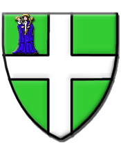
The same family is in the Stemmario Trivulziano (p. 167 (d), with the cross more like a cross formy) :
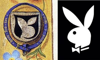
GRITTI
blazoned p. 410-411:
"Troncato: nel I° d'azzurro, alla croce scorciata e patente d'argento; nel 2° d'argento pieno". È stemma della famiglia Gritti di Venezia"

And you can see an other picture here:

The relevant pictures from the links are:


This one is from the Insignia ... V. Insignia urbium Italiae septentrionalis: Nobilium Mediolanensium - BSB Cod.icon. 270, one a set of fifteen 16th Century Italian armorials which have been digitized and uploaded to the website of the Bavarian State Library in Munich.


This image is from Wikimedia Commons.

As you can see, these arms match those on the jar in question.


The arms are those of the Gritti family of Venice, one of whose members, Andrea, was Doge of Venice from 1523 to 1538.  (More information about Andrea Gritti, as well as a portrait of him painted by Titian, can be found at http://en.wikipedia.org/wiki/Andrea_Gritti)  Given that the jar was made around 1500, it is entirely possible that it was made for Andrea Gritti while he was Doge.

I did find myself a bit annoyed at myself, since I had looked through my copy of the Stemmario Trivulziano which has yet another depiction of these arms, but I hadn't caught it.  My only excuse is that when thumbing through some 250 pages of heraldry at nine coats of arms to a page (not yet knowing a name to look up in the index), I somehow missed it.  Still, it was right there.  Well, thank goodness I have friends to help make up for my shortcomings.

Thank you all who spent some time looking for this coat of arms.  And thank you Anne, for finding not one, but three, depictions of this coat of arms.  I appreciate the help.  Truly, I do.


More Hausmarken Arms at Peterskirche in Heidelberg

$
0
0
Before getting to some of the heraldry in the interior of Peterskirche in Heidelberg, I thought I'd share two more heraldic memorials with hausmarken (housemarks) on them.


There are four coats of arms on this memorial; the one on the lower right is a hausmark issuant from a trimount and with the initials d B.  The others are: upper left, a firesteel (perhaps.  It looks a bit like a pretzel, too) issuant from a trimount with a mullet of six points in chief with the initials P G; upper right, a saltire couped issuant from a trimount between four grozing irons in annulo with the initials E B; lower left, a human figure issuant from a trimount, but everything else is too worn to make out.

Some of the text in the upper part of the monument is missing; some letters have been "helpfully" defaced, I mean, highlighted in white for easier reading.  The only name I have been able to make out that I am sure of is Dorathea, perhaps Buchtin, who apparently died aged 75 years.

It seems to me very unusual to have a housemark issuant from a trimount, but given that a trimount appears in each of the other arms on this memorial, it may be theme or heraldic treatment within this family.


And here are two coats of arms, both with hausmarken on them.  The one on the right is done with an upside-down anchor; the one on the left a "purer" form of hausmark whose main element is blazoned, according to Das Grosse Buch der Wappenkunst, a vierkopfschaft (literally, 4 head shaft).  The crossarms of the upright and the horizontal would also be blazoned (something along the lines of erniedrigter Mittelkreuzbalken if I am reading it correctly).  It's a whole little subset of blazon within heraldry, one which I have not yet had the time to adequately learn.  Someday, perhaps, in my "copious free time."

Another Good Heraldic Research Site Found

$
0
0

From a link in an article entitled “A Call to Arms! Heraldry in Renaissance Florence (And a Mystery You Can Help Solve)” by Bryan Keene in the The Getty Iris, the on-line magazine of the J. Paul Getty Museum came a discussion of heraldry in general, and a link to a really great site for Italian arms in Tuscany.

Ceramelli Papiani, blasoni delle famiglie toscane descritte nella Raccolta Ceramelli Papiani

The Ceramelli Papiani Collection, a collection of Tuscan heraldry by Henry Ceramelli Papiani (1896-1976), and now kept in the Archivio di Stato di Firenze, is now available on-line.  The project created a database of blazons and emblazons of the coats of arms of Tuscan families, drawn from various archives of Archivio di Stato di Firenze and other Tuscan Archives, many also accompanied by an  account, where possible, of historical and/or genealogical information.  The digitized database can be browsed by surname or searched by surname the blazon of any portion of the shield (in Italian, e.g., bandato, not bendy).

Unfortunately, the site is not letting me see the images of the arms. I get an error message telling me that I am “forbidden;” I assume that’s because I’m entering the site from the U.S.  Still, I can get to the blazons, and can use the site’s heraldic dictionary (or the copy I have of di Valfrei’s Dizionario di Araldica) to help determine what the arms look like.

Yes, I’ve already added the link to this website (http://www.archiviodistato.firenze.it/ceramellipapiani2/index.php?page=Home) under “Some Good On-Line Armorials and Ordinaries” in the left-hand column of this blog (as well as to the Favorites bar in my web browser).

Heraldry in the News!

$
0
0

In an article The Canberra Times, Dr. Hatice Sitki, a "national myths and symbols consultant," recommends changing the City of Canberra’s coat of arms to have it more closely reflect the city’s multicultural identity.  She recommends beginning by moving the yellow box gum tree (currently hiding behind the portcullis in the crest) to somewhere more prominent.  She feels the current coat of arms, designed by C.R. Wylie in 1928, represents the then newly-formed city's perceived national identity: white, British, monarchical, and European; making it mono-cultural rather than inclusive and/or multicultural.


Wylie wrote to the Sydney Morning Herald explaining the reasons he chose these European/British symbols to be the external identity of the city. He explained why he had rejected other Australian symbols as “being too bellicose; kookaburras, lyre birds, parrots, goannas, mopokes, and platypuses all lacked dignity; kangaroos and emus had been ruled out as overdone, and there seemed to be too little left of Australia's fauna...”  Dr. Sitki feels that the city was let down by Wylie, who thought the coat of arms had to appear ''British'' to be able to gain approval.  (Well, yeah, since approval had to come from the College of Arms in London!)

The full article, with even more background and further arguments by Dr. Sitki for changing the city’s coat of arms can be found at http://www.canberratimes.com.au/comment/time-to-celebrate-citys-multicultural-identity-20130224-2ezra.html

Heraldry in the Blogosphere!

$
0
0

In a February 27, 2013 post over at the blog First Things, Tristyn K. Bloom asks (and answers) the question, was “Hugh Hefner Inspired by Fifteenth-Century Prayer Book”?

The answer is, of course, “probably not,” but the juxtaposition of the arms of Hastings (from the Hastings Hours in the British Library) and the logo of Playboy, Inc. are striking.


The coat of arms of Hastings is Argent a maunch sable.  A maunch is a stylized medieval sleeve from a dress ("severed at the shoulder" according to J.P. Brooke-Little's An Heraldic Alphabet); the way it frames the central part of the white shield looks remarkably like the white bunny head on black that is the Playboy logo.

I don’t know about you, but I may never be able to look at a maunch quite the same way ever again.

Another Heraldic Tee Shirt

$
0
0
Once again TeeFury (http://www.teefury.com/) offers an heraldic tee shirt. This one for Star Wars fans and, as always, is on sale for just a single day.
The design, entitled Higher Education System, is by Wenceslao A. Romero, and features elements from the 1977 movie Star Wars, now known as Episode IV: A New Hope.  While very pale against the tan background here, it shows up well on the black tee shirt on which they feature it.

It’s an interesting design, but really the only heraldic thing about it is that it is on a shield. Unless you want to count crossed light saber hilts as being heraldic.  (And crossed weapons - swords, axes, etc. - actually is a pretty old heraldic motif.)

Blazon it for you, I will not.

Heraldry in the News!

$
0
0
In a recent (April 9, 2013) news article, kentnews.co.uk noted the display in the Natural History Museum in London of the first substantially complete dinosaur skeleton to be unearthed anywhere in the world. Found in Maidstone, Kent, England, the skeleton of the plant-eating iguanodon, so-named because its teeth resemble those of an iguana, was originally recognised in 1834 by a man named Gideon Mantell.

The correct name for the skeleton is now mantellisaurus named, obviously, after its discoverer.
Maidstone requested an iguanodon be incorporated in its civic coat of arms in 1946. The request was granted in 1949 and the College of Arms proclaimed: “I, the said Garter Principal King of Arms, do by these presents further grant and assign to the Borough of Maidstone the Supporters following, that is to say: on the dexter side an Iguanodon proper Collared Gules suspended therefrom by a chain or a scroll of Parchment....”
How they know what the proper coloration for an extinct sauropod (apparently, it's green) is, I don’t have a clue. On the other hand, the College of Arms has in the past defined “proper” tinctures for such mythical creatures as a phoenix and a griffin, so why not an iguanodon?
The full article can be found on-line at: http://www.kentnews.co.uk/leisure/crowds_continue_to_visit_natural_history_museum_s_maidstone_dinosaur_1_2009315

Heraldry in the Holy Spirit Church, Heidelberg

$
0
0

Trying now to get back to and finish up on our heraldic tour of Heidelberg, we returned to the church and some of its heraldry that I have written about before, way back in December 2010 (December 16 http://blog.appletonstudios.com/2010/12/holy-spirit-church-heidelberg.html and December 20 http://blog.appletonstudios.com/2010/12/little-more-heraldry-in-holy-spirit.html), the Heiliggeistkirche, the Holy Spirit Church.


Over one of the doors to the church is this great carved coat of arms-like display consisting of a sunburst surmounted by the Holy Spirit in the form of a dove rising wings displayed, with supporters of two, well, they’re not heraldic cherubs, which consist of an infant’s head with angel wings, so I’m not quite sure how these might be blazoned.  (But then, I’m a little sleep-deprived right now, and may be looking in the wrong place.

I also like the way the carver has taken the loop of garland of roses from either side and strung it “through” a pair of holes in the chief of the shield.

All in all, in addition to being a nice example of the woodcarver’s art, it’s also a nice example of canting arms and entirely appropriate for a church, don’t you think?


Heraldry in the News!

$
0
0

In an article in the Central Somerset Gazette, Councillor Jon Cousins of Glastonbury, England is quoted as saying that the town’s current coat of arms is “a device of cruelty and intolerance” and may breach equality legislation. He says it has strong anti-Catholic sentiment and pinpoints a puritanical time in the town’s history.

Admittedly, the motto (which is placed on the shield, and not below it as would normally be expected) Floreat Ecclesia Anglicana (Let the Church of England flourish), might be considered to be anti-Catholic, but it’s not a particularly Puritan sentiment. (Trust me on this; I’ve got Puritans in my family tree.  Dour bunch for the most part.) And, in fact, it could certainly be argued that the bishop’s mitre and cross croziers are not “puritanical,” either. Councillor Cousins says he believes (without saying why he does so) the crossed croziers and red background were a reminder of the treatment of the last abbot of Glastonbury, who was hung, drawn, and quartered on Glastonbury Tor following the dissolution of the Abbey.


But what does Councillor Cousins want to trade this coat of arms in for? The shield (well, one of the shields) attributed to King Arthur. No, not the blue (or sometimes, red) one with three golden crowns on it;

the green one with a cross throughout and the image of the Virgin Mary in the first quarter,
which shield the Councillor suggests should be placed beneath an image of the sun rising behind Glastonbury Tor and with the motto Unitate Per Diversitas (Unity through diversity).

Which is all arguably less “puritanical,” but I fail to see how it would be more “acceptable to Christians, Goddess and Pagan groups alike.” Councillor Cousins says that the image of the Virgin was considered acceptable to Christian faiths and pagan faiths, some of which believe Christians drew inspiration for her from the pagan mother goddess. So I guess that’s all right, as long as the pagans don't have any objection to the cross, and also so long as you don’t want to also include some of the other religions now found in England and also presumably in Glastonbury: Islam, Hindu, Buddhist, and so on. (Elsewhere, the paper notes that there are now “70 different faiths, creeds, and spiritual paths in the town.”)

Glastonbury Mayor Ian Tucker has agreed for a group of representatives from various faiths and town historians to consider if the current shield should be changed.

The full article can be found on-line at http://www.thisissomerset.co.uk/Glastonbury-shield-arms-device-cruelty/story-18482928-detail/story.html#axzz2QYxqa6zr At the end the article, the Central Somerset Gazette asks “What do you think? Is the current emblem cruel and intolerant, or should it be kept for the sake of tradition?” and includes an email address to send responses.

Heraldry in the Holy Spirit Church, Heidelberg

$
0
0


The interior of the Holy Spirit Church in Heidelberg has a beautiful Gothic vaulted ceiling, and in many of the places where the arches meet they have placed heraldic bosses.  These bosses are a mixed bag; some of them are very well done, while others are somewhat crudely painted.  I’m sure this is fine for most of the tourists they have visit there, but as a heraldry enthusiast - and someone who has a telephoto lens and isn't afraid to use it - I have to admit that I was disappointed in some of them.

Be that as it may, it’s nice to see a good attempt at using heraldry as a decorative element, and I appreciate the effort.  I will leave it up to you to decide which ones you think succeed and which ones you think ought to be redone.


A Coat of Arms for Ascension Island

$
0
0

In a news item in Coin Update, a coin has been issued marking the grant of a new coat of arms for Ascension Island. Last August, Queen Elizabeth II approved a new coat of arms for Ascension Island, a design drawn up by the College of Arms in London. Prior to this approval from the Queen, Ascension Island used the coat of arms of the United Kingdom for official purposes.


The £2 coin was issued on March 8 by the Government & Treasury of the Ascension Islands.

A volcanic island in the South Atlantic, Ascension Island is governed as part of the British Overseas Territory of Saint Helena, Ascension and Tristan da Cunha. It is named after the day of its recorded discovery, Ascension Day.  (Not unlike Easter Island in the Pacific.)

The fewer than 900 Islanders were asked what they would like to see on the coat of arms, and the design was based on the features they suggested, including the sea turtles (used here as supporters) that lay their eggs on Ascension’s beaches.

The complete article can be found on-line at http://news.coinupdate.com/ascension-new-coat-of-arms-granted-1889/

Heraldry in the Movies!

$
0
0
Facebook poster, fellow blogger, and heraldry enthusiast (among several other things) Father Guy Sylvester pointed out that, in light of the new Iron Man 3 movie opening next weekend, discussions will start up again about what the coolest thing about Tony Stark (played by Robert Downey, Jr.).  Father Guy notes that the first Iron Man movie has already revealed "THE. coolest. thing. ever. In the scene showing Tony in his private jet we see on the wall behind him that TONY STARK HAS A COAT OF ARMS!!!"

I'd blazon it as Azure a double-headed eagle displayed and on a chief Argent three mullets Azure.

Unfortunately, it appears to follow a common "bucket shop" motif of placing the surname on what should be the motto scroll beneath the shield.

Heraldry in the Holy Spirit Church, Heidelberg

$
0
0

Are you getting tired of photograph after photograph of some of the heraldry I saw in Heidelberg?  Me neither.  But all good things must come to an end; we were really there for only two and a half days, and were spending a fair bit of time looking for addresses and sites related to my German ancestors there, so there really is only so much heraldry that I could have photographed during our stay.

Anyway, this will probably be the last post of heraldry in the Heiliggeistkirche off the main Market Square in Heidelberg.  And there may be one more post with some miscellaneous heraldry seen in and about the city, but that will be the last of it.  (Unless I go through the photographs one more time and find something that I simply have to share, of course!)

Anyway, there are some great carved heraldic monuments in the Holy Spirit Church, fine examples of both German heraldry and the stonecarver's art, most done in the red sandstone from which so many things in the city are made.  Enjoy!


The arms over her right shoulder, on the left as you look at the picture above, are very similar to the arms of Nuremberg with the main charge being a crowned frauenadler (in English, harpy), only here there are four mullets of six points surrounding the frauenadler.


I very much doubt that the lower shield here is the arms of Ireland, Azure a harp Or.  (Just a suspicion on my part, but I bet I'm right.)

A Little More Heraldry in Heidelberg

$
0
0

Okay, barring something unforeseen (like me finding some more photographs of heraldry in the city that I just have to share with you!), this should be the last installment of some of the heraldry that we saw in the city of Heidelberg during our stay there last fall.

Enjoy!


Every time I look at this display of heraldry I see something new.  I love the "realistic" depiction of the ermine tails on the mantle.  And the inescutcheon of Bavaria with a smaller inescutcheon denoting the King of Bavaria as a Prince Elector of the Holy Roman Empire.  And the collar of the Order of the Golden Fleece.  Among other things.


The armorial display above is a great example of the German use of multiple crests to go with (at least some of) the quarters in the arms.


A beautifully simple coat of arms!

An Overdue Follow-Up

$
0
0

This is a little overdue, but I didn't see the follow-up to my earlier post until very recently.

I had blogged about the inmates at a correctional institution who had made the cow on the Vermont coat of arms decal to be placed on state police cruisers into a spotted cow; specifically, one with a spot shaped like a pig.  That post can be found at http://blog.appletonstudios.com/2012/02/heraldry-in-news.html

Now I've run across a news story from shortly after that which noted that the police were closing the case.


State officials said female inmates at the prison work center in Windsor are responsible for altering the state seal back in November 2009, putting pigs on the side of Vermont state police cruisers, but exactly who did it may remain a mystery.  "At this point all we can tell is how many women had access to the file, and who they were," Corrections Commissioner Andy Pallito said. "Really being able to tell who manipulated the file last is virtually impossible without somebody stepping forward and saying I did it."

The story noted that one group was hoping to keep the image alive. They've created a Facebook page called "Save the Vermont Pigs," and had upwards of 1,000 fans.  "It is a really good opportunity for us to band together as Vermonters and show that we can have a laugh in a little bit of an awkward situation, and it is certainly not the first time we have done that," says Cid Sinclair with Save the Vermont Pigs.  Sinclair said this was prank could be used to do some good. He would like to see the decals auctioned off-- an idea that has the support of Lt. Governor Phil Scott.

There's a bit more in the story, of course, along with some pictures of the decals and a close-up of the offending pig spot.  You can read the whole thing on-line at http://www.wcax.com/story/16948395/police-close-case-on-altered-vt-state-police-decals

I have to admit, I'd be tempted to buy one of those decals myself!


And Speaking of the State of Vermont ...

$
0
0

What had led me to the follow-up story about the Vermont coat of arms with a pig as one of the cow's spots was a comment in an April 28, 2013 article on VTDigger.com entitled In This State: The branding of Vermont, wherein they interview Scott Reilly, an archivist at the Vermont State Archives in Middlesex, and give a nice history of the coat of arms of the state, complete with illustrations of various depictions through the years.


My personal favorite example from the article is this one, full of bright colors and depth and plenty of gilding, but others pay prefer some of the historical examples, ranging in date from 1779 to 1903.

Interestingly, it wasn't until 1862 (right in the middle of the American Civil War) that Vermont codified a description of the state's coat of arms: The fields and trees are green, the sky yellow, the Green Mountains blue. A pine tree dominates the center, flanked by three sheaves of wheat and a red cow. The crest is a buck's head with antlers, and two crossed pine branches appear at the base and sides. A ribbon bearing the motto "Freedom and Unity" floats across the base.

I could probably add a lot more here, but it would continue to be duplicative of the article.  If you'd like to know more about the origins and history of the landscape coat of arms of the State of Vermont, feel free to follow the link here to the article and read it for yourself.  It can be found on-line at http://vtdigger.org/2013/04/28/in-this-state-the-branding-of-vermont/

The Gore Roll of Arms, Again

$
0
0

I like to talk about the Gore roll of arms every now and again, simply because it is my belief, based on many interactions with heraldry enthusiasts here in the United States and around the world, that far too few people even know of its existence, and of those that do, the majority are only aware of it through the most widely available, but flawed, source.

The Gore roll is a roll of arms which was created in the mid-1700s containing color reproductions of arms dating back to the early 1700s, created by the Gore family of sign and herald painters in colonial Boston, Massachusetts.  You can find the presentation I gave on the Gore roll at the International Congress of Genealogical and Heraldic Sciences held in Bruges, Belgium in 2004 at http://www.appletonstudios.com/Congress2004DBA.pdf  (The illustrations in that .pdf are black and white line drawings which I created, since the full-color illustrations from the Gore roll are held in copyright by the New England Historic Genealogical Society, which owns the roll.)  Still, you can get an idea of the roll from the photograph below, taken when I was able to visit the NEHGS and given a peek at the original.


As I mention in the article noted above, most people get their knowledge of the Gore roll from the publications of William Whitmore in the mid-19th Century.  Unfortunately, there are errors at two levels in those publications, in that they (1) were done from an imperfect copy of the roll (to be fair to hmi, the original had disappeared at that time, and was only rediscovered in the 1930s) and not the original, and (2) Whitmore introduced some additional errors of his own.

When the original was rediscovered in the possession of some Gore family descendants, it was purchased from them by Dr. Harold Bowditch of the NEHGS, and remains in their holdings today.  Dr. Bowditch did a good review of the roll which was published in the The Rhode Island Register, the journal of the Rhode Island Historical Society.  The trouble, of course, is that copies of that review (or a later 1983 reprint) are hard to find except in the very best genealogical libraries.

In an effort to try to make information about this unique historical American roll of arms a little more widely available, I wrote a new volume about it and published it myself.  This most recent review of the Gore roll is the first to include illustrations of all of the arms contained in it, as well as containing Whitmore's and Dr. Bowditch's writings about it along with some additional information and illustrations of other usages of some of the arms in the roll.  (I would have included color reproductions of the arms, but the cost to obtain the necessary permissions would have meant that I would have had to at the very least double the price of the book, and it's already more expensive than I would like as it is.  So, black and white line drawings it is!)

If you'd like more information about this roll of arms beyond the .pdf article noted above, you can see more, including sample pages - and buy the book - at http://www.appletonstudios.com/BooksandGames.htm

If I've Said It Once ...

$
0
0
... I've said it a thousand times:  "Don't exaggerate!"  No, wait, that's not what I've said.  What I've said is:

"You can find heraldry (or heraldry-like logos) everywhere."

The last time we were visiting Chicago (a great town for architecture, as well as history, good food, and good friends), as we were driving around we spotted the following logos from the car.


The first was the coat of arms on the facade of York Furrier.


As you can see, it's a bit of a mash-up, with what almost looks more like a "sash sinister" than it does a bend sinister, a crown in base whose posture is probably best described as bendwise, an English esquire's helm with a crest of a rampant more-than-demi unicorn holding something between a pair of Germanic-style buffalo horns.

The other was very much an "arms-like logo" on the canopy over the door of Bath Crest.


Here, the bend sinister is unambiguous, between the capital letters B and C.  On the other hand, I'm not at all certain what the thing above the shield, where one would normally expect a helm and crest (or sometimes just a crest) is supposed to be.  (In conjunction with the name, it reminds me of a toilet seat and lid edge on, but probably is just me.)

So as I said, you can find heraldry everywhere!  Even just driving down the streets of a major city in the American midwest.

Heraldry in the News!

$
0
0
There was a nice article recently in the pages of The Whig-Standard (through its on-line edition) about recent repairs to, and a history of, the large (8' x 5' with its wooden base, and weighing 400 pounds) embroidered coat of arms (though the paper incorrectly calls it a "crest") of Queen's University at Kingston in Kingston, Ontario, Canada.  For those of you interested in a history of the university, founded in 1841, you can see more, as well as another rendition of the university's arms, at http://en.wikipedia.org/wiki/Queen%27s_University


The creator of the embroidered coat, Carolyn Pickering, is shown above doing a little repair work on it.  She originally created it over the course of three months some 40 years ago as a dramatic centerpiece for some of the activities of the University, such as convocations.

The full story, and more details about the embroidered coat of arms, its history, and how many men it takes to move it, can be found on-line at http://www.thewhig.com/2013/04/28/queens-crest-heavy-on-history

Oh, My!

$
0
0

It's possible that this would have caught my eye anyway, seeing as it is heraldry, of a sort.  But since one of my grandsons (I know, I know!  I look too young to have grandchildren, don't I?) is, or was, an enthusiast, I had a double interest in this coat of arms.

This is for guys who like My Little Pony; they call themselves "Bronys" (presumably from combining "bro" or "brother" with "pony" ... "Brony.")  (He's since gone into an intense Dr. Who phase, so I don't know how closely he follows Brony-dom currently.)

Anyway, it was just too, umm, too, well, umm, yeah, too.  So I felt I just had to share it with all of you.

Please accept my apologies for any eye damage.

Viewing all 1369 articles
Browse latest View live