Quantcast
Channel: Heraldry
Viewing all 1369 articles
Browse latest View live

Some Heraldic Humor

$
0
0

I was reminded a few days ago of some heraldic jokes that one of my early heraldic mentors, Jay Rudin, created some years ago.  (Have you ever noticed that many heralds seem to have a really wicked sense of humor?  Many of the ones that I know, both professional and amateur, seem to have one.  It's sometimes kept mostly hidden, but when it does appear, it's usually both intelligent and funny at the same time.  But I digress.)

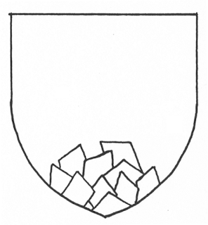
As I say, I was reminded of some heraldic jokes which he called "extraordinaries" that Jay had drawn up.  Some were simply different interpretations of heraldic blazon, such as this one, which he blazoned as Ten lozenges in pile.


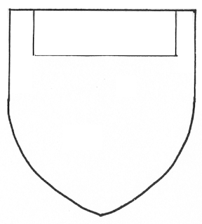
Others were an heraldic treatment applied to a different heraldic charge, for example, "a gore in its piety."  It was all very amusing, until one day while doing some research, I found some actual examples of Jay's extraordinaries used in real coats of arms.  The first one that I ran across (and I'll share a few of the others in the future) was this one, which Jay had blazoned a "fylfess," that is to say, a fess couped whose ends were treated like the arms of a fylfot (what is blazoned in German a halbrueckenkreuz).


Then, in Siebmacher's Wappenbuch von 1605, I saw the arms of Koelderer.


The first and fourth quarters, Gules, two "fylfesses" in pale Argent, right?  And on the crest, too?  You mean it's not a joke charge?  Well, I'll be.

I have tried to find what the charge is actually blazoned, but it doesn't seem to appear in my favorite "go-to" book for German blazon, Das Grosse Buch der Wappenkunst.  So I don't know what it's actually named in German.  But still, who'd have thought that an heraldic joke would turn out to be a real heraldic charge?


Some More Heraldic Humor

$
0
0

Okay, while I'm still thinking about them, I'll do another one of Jay Rudin's "extraordinaries" of which I found real-life heraldic examples.

This one he blazoned as a "chief couped."


And he had another one that he called a "quarter in nombril point."


And the arms that I found that seems to combine both of those "extraordinaries" was the arms of von Ruesdorf, also from Siebmacher's Wappenbuch von 1605.


Das Grosse Buch der Wappenkunst blazons this charge as das Orth, 2/7 der Schildbreite; basically it's a delf or billet issuant from center chief, 2/7 the width of the shield but extending to the fess line.  So it's not a perfect match for the joke charge, but it is a reasonable facsimile of the combination of two of them.

Who'd have thought?

I Am Not Making This Up!

$
0
0

"Incensed, (fr. animé): said of panthers and other wild beasts borne with fire issuing from their mouths and eyes."  (Parker, A Glossary of Terms Used in Heraldry)

"animé: [Fr.] animated; excited; spoiling for a fight; hence, of a beast depicted with eyes gules, not, as often er[roneously] stated, one breathing fire and exuding flames from the ears which is blazoned 'incensed' (q.v.)"  Franklyn and Tanner, An Encyclopaedic Dictionary of Heraldry)  (Of course, under "incensed" they merely say, "see animé.")


So I guess the logo of the Baltimore Blast (a soccer, as we say in the States, or fútbol south of the Rio Grande River, team based in Maryland) could be blazoned as: a soccer ball incensed.  (The image above is taken from a flyer announcing a game between the Baltimore Blast and and the local Dallas Sidekicks.)

I suppose an argument could be made for it to be blazoned as a type of fireball, but most fireballs I've seen have only four flames, issuant from a roundel to chief, base, and each flank (or the four cardinal directions, if you prefer).  No, I think I prefer a soccer ball incensed.

Heraldry in the (Old) News

$
0
0


Well, it's not exactly breaking news; in fact, it goes all the way back to April 2011, nearly two years ago.  But a program that I use to search out news items and blog posts, etc. for things heraldic just found an old news story about the new coat of arms of the Middleton family, granted them by the College of Arms shortly before daughter Kate's marriage to William Windsor.

RTR2LE4A

The article, entitled "Kate Middleton’s Coat of Arms: What Do Those Acorns Actually Mean?", asks a question we often see in heraldry, but which many times cannot be answered nearly so well as it is here.  That is because in this instance, Thomas Woodcock, who helped design the arms, could tell us what the various elements mean.  "Three acorns represent the three Middleton children (Kate, Pippa and James), and invoke the oak tree—a symbol of west Berkshire, where the family has lived for 30 years. The division down the middle of the crest is a play on the Middle-ton family name, while the gold chevron refers to Carole’s maiden name Goldsmith."

This sort of explanation is not often the case.  Many times, unless either the bearer or the designer (as in the case of the Middleton arms) left us notes explaining the meanings of the colors and charges on the shield, or unless the arms are a cant, or pun, on the name (e.g., the hand and chief with three roosters, or cocks, in the arms of Hancock, below), it is difficult to guess, much less know, why those colors or charges appear on the arms.


Yes, I know that there are websites and books that purport to tell you the meanings of the colors and charges, but in truth there are no generally accepted meanings for these things.  Indeed, different compilations of such meanings often disagree with each other, to the point of having one charge mean completely contradictory things!  And as Lowe in his Curiosities of Heraldry notes: “It does not seem to have occured to these allegorizing worthies that the tincture of a charge may be diametrically opposed to the signification assigned to the charge itself. For example, the coat ‘Vert, a bull's head or’ by the armilogical rules cited above, would signify, as to the tinctures, pleasure and joy, while as to the charge it would mean rage and fury. Again, ‘Purpure, a wolf argent’ would mean ‘a wrangler with a peacable disposition!!’”

A good discussion of the significance of the meanings of charges in heraldry can be found in the Most Frequently Asked Questions of the rec.heraldry newsgroup, available on line on Francois Velde's Heraldica at http://www.heraldica.org/faqs/mfaq

Anyway, although about an event not exactly current, it's a nice little article (well, except where they make the all too common error of calling a coat of arms a "crest") about some heraldry where we can actually learn the meanings of some of the colors and charges.  It can be found on-line at http://newsfeed.time.com/2011/04/25/kate-middletons-coat-of-arms-what-do-those-acorns-actually-mean/

Happy Birthday, CHA!

$
0
0
The Canadian Heraldic Authority turned 25 years old this month.  And Canada Post/Postes Canada is celebrating that milestone by issuing a stamp which features the arms and crest of the Authority, and which can be purchased with a special commemorative envelope with the full achievement of arms (with the raven-bear supporters) of the CHA.

It's nice to see a celebration of Canadian heraldic art in this way.

More information, as well as the opportunity to buy one (or more) of these envelopes for yourself, can be found on Canada Post's website at http://www.canadapost.ca/shop/stamp-collecting/commemorative-envelopes/p-341951.jsf;CPO_JSESSIONID=8ycXRyQHwDQW112d4gyTccGlLyGbVSqxDC9TCwSfySd6symVwvZG!-2067945754?execution=e1s1

Want to Buy Some Fine Armorial Silver?

$
0
0

But first, I'm going to shamelessly copy from C.W. Scott-Giles'Motley Heraldry:

These arms the Nelsons bore in days of old:
A black cross flory on a shield of gold,
And over all a bendlet gules, to show
Due difference from Samson and Lamplow.


When one Horatio Nelson rose to fame,
With ‘Sir’ and ‘K.B.’ bracketing his name,
The Kings of Arms his scutcheon did resplend
With three exploding bombs upon the bend.


Later, they gave Lord Nelson of the Nile
An augmentation in a lavish style –
A ship disabled and a fort destroyed
(Which probably the Baron much enjoyed.)


When Viscount Nelson of the Nile at last
Beyond the reach of earthly honours passed,
His brother (made an Earl), the heralds gave
The golden word TRAFALGAR on a wave.


The shield is a fine biographic gloss,
But where, alas! is Nelson’s ancient cross?


And why is that bit of doggerel (albeit amusing) of any relevance at all?  Because for someone with the interest, and a fair bit of spare cash, it is possible right now to purchase a piece of silver in the form of a covered entree dish made for and with the armorial insignia of Lord Nelson of the Nile.


The dish is described as "a magnificent silver entree dish and cover, rectangular with gadroon edges, the domed cover engraved with a presentation inscription from Lloyds Coffee House on one side and Nelson's coat of arms on the other; with removable finial designed as the Chelengk crest of Admiral Lord Nelson. The dish cover additionally engraved inside with the crests of Admiral Lord Nelson." The dish and cover are numbered No. 2 (of the original set of four).


The inscription reads: "Lloyd's 1800. Presented by the Committee, for managing a Subscription made for the Wounded and Relatives of the Killed at the Battle of the Nile, To Vice Admiral Lord Nelson and Duke of Bronti [sic], K.B., &c, &c, &c, who was there wounded, As a testimony of the sense they entertain of his Brilliant Services on the first of August, 1798, when a British Fleet under his Command obtained a most decisive victory over a Superior French Force. J. J. Angerstein, Chairman"


The handle of the cover is, as noted above, one of the crests of Admiral Lord Nelson, to wit: Issuant from a naval crown, a representation of the Chelengk (a fine large jewel designed as an aigrette of diamonds and a traditional award for bravery, rarely given to foreigners, which was given to Nelson by the Turkish sultan).

If you think you might be interested, either in seeing more images of or purchasing this unique piece of history, it is available for sale from Heraldic Silver, Ltd., and can be seen on-line on their myfamilysilver.com website at http://www.myfamilysilver.com/mp/item/20815/nelson-highly-important-and-historic-george-iii-armorial-silver-entree-dish-and-cover-presented-to-admiral-lord-nelson-by-lloyd-s-coffee-house-after-the-battle-of-the-nile  Or if you happen to be in the area (which, alas, I am not), the dish will be the highlight of their stand at the Fine Art & Antiques Fair, Olympia, London from 6 to 16 June.

A Friendly Reminder

$
0
0

Please don't forget to check out the lists of links that you can find down the left-hand side of this blog.  (No, this is not a shameless plug; with the exception of the links to Appleton Studios and my wife Jo's blog, I have no relationship with, and make no money from, any of the links I've placed here.  They are just links to websites and other blogs that I think may be of interest.)

I have tried to make this blog a resource for folks who are interested in heraldry, and will add new sites as I find them.  That said, I've only got so much time that I can spend cruising the web for such sites.  If you know of a website or blog that would be of interest to the readers here, please feel free to bring it to my attention.

Conversely, if you find that any of the links I've placed here are broken, or the website moved, etc., please let me know about that, too!  I'd like to keep all of these links current, but don't always have the time to review the ones already here as often as I would like.

So, anyway, please feel free to check out the links I've listed here.  The categories (and, yeah, I know you have to scroll down the page pretty far to get to some of them; I'm still working on ways I can make that easier) are:

     Some Articles I've Written
     Other Blogs of Heraldic Interest
     Websites of Heraldic Interest
     Heraldic Artists' Websites
     Some Good On-Line Armorials and Ordinaries
     Military Heraldry Websites
     Some Good On-Line Heraldry Books
          and
     On-Line Heraldic Clipart

Anyway, thank you for dropping by!  I hope that you find at least some of these links to be of interest.

High Praise from a Fellow Blogger!

$
0
0

Marc Sinniger on his French-language blog Héraldie: Le blog des Héraldiens de l'école Lacordaire has published a short post about this blog, Heraldry: Musings on an esoteric topic.  He says some very nice things about it, mentioning in particular both my regular postings that "you can find heraldry anywhere!" as well as the lists of links to other sites of heraldic interest.  (The list of links includes his own blog under the "Other Blogs of Heraldic Interest" heading.)

I'd like to publicly thank Monsieur Sinniger here for his kind words about this blog.  If you'd like to read his post, it can be found on his blog's site at http://heraldie.blogspot.fr/2013/06/heraldry-musings-on-esoteric-topic-de.html


Just Because ...

$
0
0

... something is placed on an escutcheon, a shield shape, that does not necessarily mean that it is, or is trying to be, heraldry.  Case in point ....
This particular design was being discussed a week ago over on the SCA Heralds newsgroup.  It is the logo of Ashford University of Clinton, Iowa (http://www.ashford.edu/).  Some folks went so far as to try and blazon it; the most successful attempt was Purpure, a "bend" argent, overall a bend sinister counterchanged tenne and Or and a base counterchanged azure and purpure.

But is the ability to create a blazon for a design like this mean that it is, is trying to be, or should be considered to be, heraldry?  I don't think so.  Steve Mesnick, posting on June 13, 2013, said as well as, if a bit more emphatically than, I would:

"It happens to be vaguely escutcheon-shaped, because I imagine it's INSPIRED by traditional educational-institution heraldry. I WILL grant you that. But it's NOT their coat of arms, and it's not TRYING to be. The fact that WE want it to be their coat of arms is OUR problem, not theirs."

So, yes, it's on a shield shape.  But it isn't, and doesn't seem to be trying to be, a coat of arms.  As a corporate logo, it's eye-catching, distinctive, and unique.  All good qualities for a modern logo.  And it may, indeed, be trying with the shield shape to tie itself into a long tradition of educational heraldry.   But ...

Just because it's on a shield shape doesn't mean that it is heraldry.

What a Beautiful Manuscript!

$
0
0

Oh, yeah, it's got some nice heraldry in it, too.

The British Library has placed on-line a manuscript, dated 1444-1445, "A collection of fifteen romances, chivalric treatises, instructional texts, chronicles and statutes compiled as a gift to Margaret of Anjou, on her betrothal to Henry VI, from the 1st Earl of Shrewsbury, who escorted her to England."  Each section has a description at the top of the window that opens when you hover your cursor over it that describes the portion of the work you are seeing.

It's got some wonderful artwork in it, as you can see from this example below.


I haven't had the time to go completely through it yet (that will take some time!), but it is well worth the look if you are at all interested in either 15th Century manuscripts, or 15th Century heraldry, or both.

The bound manuscript's images can be found on-line at http://www.bl.uk/manuscripts/Viewer.aspx?ref=royal_ms_15_e_vi_f003r#

Computerized Heraldry ... Again!

$
0
0

I spend far more time than I should puttering about on the "information highway," and periodically I run across something that I consider to be worth sharing with you.

Over the years, several individuals have tried to write software that would create an emblazon - a drawing of a coat of arms - from the blazon - the word description.  And it is the sort of thing that you'd think would be not terribly difficult.  The language of blazon has its own very specific grammar and structure which should make it amenable to being done by computers, at least to a decent extent.

The trouble is, of course, is that all of the programs that I've found over the years have had some pretty serious limitations, like the one where the blazon had a sword fesswise on a chief, but the program crammed the sword in palewise, a very unartistic result.

This most recent entry is a website (Blazonry Server, at http://web.meson.org/blazonserver/) that you can go to and type in a blazon, then choose an output format (.png or .svg), and then click the "Render Blazon" button to have the program draw the coat of arms for you.  And it actually isn't too bad, as you can see from the first two examples below, sampled on the site, of a very simple coat of arms, and then a more complex one.


But then, of course, I felt the need to type in the blazon of my own arms, with this result.

So I'm guessing that "apples" are not in the program's definitions yet.  (To be fair, the website does say that it's mostly the geometric charges that are represented in its database.)

Still and all, it's a fun site to play around on, trying out different blazons and seeing what the program creates.  As my alter ego Da'ud Bob ibn Briggs, Historical Drive-In Movie Critic (www.appletonstudios.com/movies1.htm) would say, "Check it out!"  I'll probably be spending some time there myself, seeing what it will do the the arms of, say, Calvert, and Crossland.  (The quarters of the arms of the State of Maryland.)

American Revolution Heraldry

$
0
0

I've said it many times before, and I'll probably say it many times in the future: "You can find heraldry everywhere!"

In this case, I was reading the Boston 1776 blog which is about, you guessed it, Boston, Massachusetts in and around the year 1776.  And there, big as life, was a bit of heraldry on my computer screen.

The post was about a demonstration at the Paul Revere House by Fred Lawson, a founder of the Royal Irish Artillery reenacting group.  (The full post can be read at http://boston1775.blogspot.com/2013/06/the-royal-irish-artillery-at-revere.html)  Accompanying the post was the above photograph of an officer's button with the arms of the Royal Regiment of Irish Artillery, dated 1785-1801.

According to the post, seventy men from this unit were transferred into the Royal Artillery to accompany General John Burgoyne's expedition down from Canada in 1777.  They were captured by American forces following the battle of Saratoga.

The button (which is available for purchase from The Military Campaign at http://www.themilitarycampaign.co.uk/badges/product/296-royal-regiment-of-irish-artillery) shows the arms of the Royal Regiment of Irish Artillery.  I have not found a color emblazon of the arms anywher, but I would assume that the field is azure (blue) with the golden harp of Ireland; the cannon would be either gold or silver, as would the chief, which has the Royal crown (normally gold) and two roundels representing cannonballs (probably black, which are sometimes blazoned, appropriately enough, as gunstones, though they have also been blazoned as pellets and as ogresses).  Were I to guess at a blazon, I believe it would most likely be: Azure, in pale an Irish harp Or stringed Argent and a cannon Or [or Argent], on a chief Argent the Royal crown Or between two gunstones [or, roundels Sable].

Whether my speculative blazon is correct or not, it was still a neat bit of historical heraldry that played a role in the American Revolutionary War.

So Many Projects … So Little Time

$
0
0

I was reminded again the other day of just how many heraldic projects that I have which are currently “on hold” awaiting the availability of more time in which to actually do them. The time is coming when I may really be able to sit down at my desk and get to work on many of them. Unfortunately, that day has not yet arrived; the need to do things like pay the mortgage on the house and buy such minor incidentals as, say, food and electricity (necessary to accomplishing any meaningful work on a computer), keep me working at my full-time job.

But, as I say, I was reminded of one of these heraldic projects the other day by a posting on Facebook. Some of you may already know that I had written a small book entitled Camels In Heraldry (information about which can be found at http://www.appletonstudios.com/BooksandGames.htm). Shortly after publication, I found some more coats of arms and crests with camels in them, and so have begun a file for a supplement or a second expanded edition of this book. Well, this post on Facebook linked to a book owned by the Bavarian State Library in Munich, Das Wappenbuch Conrads von Grünenberg, Ritters und Bürgers zu Constanz– BSB Cgm 145, um 1480, which can be found on-line (and downloaded!) from http://bsb-mdz12-spiegel.bsb.lrz.de/~db/0003/bsb00035320/images/*

In a quick look through this copy of Conrad von Grünenberg’s Wappenbuch, I noticed on p. 55 two different coats of arms with camels on them.


One is the arms attributed to the king of “Cana” in greater India, Or a native [Moor?] Proper[? He’s kind of an iron-gray color all over] astride a camel statant Gules.


The other is the arms attributed to the king of “Manchy” [? It’s not easy to decipher the handwriting in the short time I’ve had available to look at this), also in India, Vert a Bactrian camel statant Or.

Now, while I am happy to have found two more coats of arms to add to my work on Camels In Heraldry, it did serve to remind me that I have a number of heraldic projects waiting for my time and attention to complete. So, yeah, I’m afraid I’m rapidly getting to the point where retirement from full-time employment cannot come too soon. Because when it does come, I should be able to get some of these projects completed, something I hope that we all can look forward to. I’ll be sure to keep you posted as they develop.


*There are a whole lot of old heraldic books which can be viewed and/or downloaded from the Library. There is a link in the left-hand column of this blog under “Some Good On-Line Armorials and Ordinaries” for the Münchener DigitalisierungsZentrum Digitale Bibliothek, where the link (http://www.digitale-sammlungen.de/index.html?suchbegriff=wappenbuch&c=suchen) will take you to a results pages for a search for “wappen” in their holdings.

As I Have Said Many Times Before ...

$
0
0
... you can find heraldry (or at least stuff that is trying to look like heraldry) everywhere!

In this case, I found it at work.  Specifically, on a three-ring binder from a client's staff handbook. I found the following:


Shelton School located in Dallas, Texas, serves over 800 students with learning problems such as dyslexia, or who have difficulty with reading comprehension, math, written expression, and attention. The school provides specific instruction/remediation for students from three years of age through the 12th grade.
When I went to check out their website, though, I found that they have apparently changed (I suspect the term used would be "updated") their arms-like logo to the above image.  In some ways, it's an improvement, in that it is slightly less cluttered and thus more quickly identifiable.  (I'm not at all sure how the field would be blazoned, though; per bend sinister azure and azure?  No, that can't be right.  As heraldry, it still needs work.)

Still, though, to me this example helps to point out one of the differences between having real heraldry, a coat of arms, and having a logo (even if it is "arms-like").  Heraldry can be pretty timeless; sure, artistic interpretations will vary, depending on the artist drawing the arms, and I think that is a good thing.  That makes it possible to "update" or "modernize" the arms without the need to send off to yet another graphic design firm and pay them a bunch of money to redesign the logo.  Want your coat of arms to look more modern?  Find an artist who can draw them in a more modern style, and you're good to go, and at a tiny percentage of the price.  (Yes, good heraldic artists cost money, but have you seen what graphic design firms charge for a new logo?  You're talking some very big bucks there!)

Flag in the News!

$
0
0

Fellow blogger Jeremy Hammonds, on his Maine Heraldry Blog (a link to his blog can be found in the left-hand column here, under Other Blogs of Heraldic Interest), recently discussed the adoption of a flag (that in my opinion would also serve well as a coat of arms, should the city decide to go that route) by the city of Bath, Maine, on July 3, 2013.


I'm sure that Jeremy's post is at least in part because of his pride in having played a role in the design and adoption of the flag.  Given the very clean design and easy identifiability of all of its elements, I think his pride in this achievement is well-earned.

I could probably say a lot more about this new flag, but so much of it would simply repeat what Jeremy has already posted - along with a brief but interesting history of the design and the various elements, as well as the two coats of arms which served as inspirations for it - that you'd do just as well to go to his blog and read about it there.

His post, "City of Bath adopts flag," can be found at http://www.jeremyhammond.net/archives/102


Once Again ...

$
0
0

... and as I noted in my last post, "You can find heraldry everywhere!"

In this case, it was while I was shopping at the mall, where I ran across a display of mannequins wearing black tee shirts with this logo:


There are a couple of ways to blazon this.  It's either:

Argent a cross quarter-pierced and on a chief sable an African lion passant adumbrated* argent, or

Checky of nine argent and sable, on a chief sable an African lion passant adumbrated argent.

Though the image is fairly small and not as clear as I would like (what can I say?  My telephone does not take especially good pictures.  Of course, when I was younger, the only thing you could do with a telephone was to talk to people on it), it is still clearly an African rather than an heraldic lion on the chief.

My only real quibbles with the design is that the helm is unnecessary, lacking a crest as it does, and the mantling tends to overwhelm the entire design.  Still, though, as a trademark, it is pretty distinctive and quickly identifiable, which are some of the qualities of better heraldic design.


*  Parker's A Glossary of Terms Used In Heraldry defines "Adumbration, or Transparency: the shadow of a charge, apart from the charge itself, painted in the same colour as the field upon which it is placed, but of a darker tint, or, perhaps, in outline only.  The term belongs rather to the romance of heraldry than to its practice, and is imagined by the writers to have been adopted by families who, having lost their possessions, and consequently being unable to maintain their dignity, chose rather to bear their hereditary arms adumbrated than to relinquish them altogether.  When figured by a black line the bearing is said to be entrailed."

Technically the lion in the arms above, not being of a darker shake of black, is not truly adumbrated, but being outlined in white, is not truly entrailed, either.  What it is, is a white outline of a lion on a black chief.

Heraldic Art in the News!

$
0
0

There's a nice (albeit short) article at Rochdale Online about Charlie Oldham's commission by the Oldham Borough Council to carve the Borough's achievement of arms (and seven other coats of arms and badges) for display in the Oldham Civic Centre.


The large achievement is six feet in diameter, making this a really impressive piece of work.  Of course, Mr. Oldham is a member of the Society of Heraldic Artists, and it's easy to see why looking at his work above.  (I wish the photo from the article were a little clearer; I'd really like to see more of the details of some of the smaller carvings.)

The full article, and another photograph of some of the work in progress in his workshop, can be found on-line at http://www.rochdaleonline.co.uk/news-features/2/news-headlines/81516/rochdale-man-carves-oldham-coat-of-arms

A New Book of American Heraldry

$
0
0

The Committee on Heraldry of the New England Historic Genealogical Society is publishing a new book of the Roll of Arms registered by the Committee between 1928 and 1980, previously published over the years in a series of nine booklets.

It is still possible to find some of these booklets on such websites as eBay (this is how I have managed to acquire Parts 1, 2, 6, 7, 8, and 9), but they are clearly pretty rare and it takes a lot of hunting to acquire a copy.

So it comes as good news that the NEHGS is going to republish these historical American arms in a single volume.

According to the NEHGS website, A Roll of Arms will sell for US$34.95, and will be available in July 2013, although Jeremy Hammond of the blog Maine Heraldry has noted in a posting in the forum of The International Register of Arms that email correspondence from Henry Beckwith of the Committee on Heraldry has said that the volume will not be available until the end of this year.

Still, whether this month or later this year, this volume is going to be a worthwhile addition to the library of anyone with an interest in American Heraldry.  You can be sure that as soon as it is available, I will be adding it to mine.

A description of the book and ordering information can be found on the NEHGS website at http://www.americanancestors.org/Product.aspx?id=27963

Heraldry in the News

$
0
0

But, apparently, not all that newsworthy.

Or, maybe it's newsworthy, but neither controversial nor interesting.

In a story on July 11 in the Niagara-On-The-Lake Town Crier, it was noted that at a public meeting at Niagara-On-The-Lake to get input from the public on the town's updated coat of arms and flag, only half a dozen people showed up, none of whom were the town councilors.

So, apparently, as the process of obtaining a grant of arms and a flag from the Canadian Heraldic Authority nears its end, nobody cares.

Or, what I hope is more the case, no one has any real objections to the design.


In any event, you can read the full article with more details and additional background, as well as quotes from Albion Herald Extraordinary Bishop Ralph Spence, on-line on the website of NiagaraThisWeek.com at http://www.niagarathisweek.com/news-story/3887787-poor-turnout-for-flag-consultation/

"Everything Old Is New Again"

$
0
0

And that old saw from the song seems even truer in heraldry.

There was an article about the University of St. Mark and St. John (known affectionately as "MarJon") in Plymouth, England, "arguably the third oldest higher education institution in England," according to Gil Fewings, the University's resident archives assistant.  Whether the university is or isn't the third oldest, it is nearly 175 years old this year (or, at least, its constituent colleges are).

But Kerryanne Delbridge, Head of Marketing and Communications, said the identity of the institution had become confused.  "In recent years the logos were replaced by the blue-grey 'swoosh' style that had been used since becoming a university college in 2007."

That would be this little item immediately blow, a graphic designer's dream, no doubt, but not terribly good at demonstrating graphically what the organization is or what it is all about.


Since the University has a coat of arms -- this one --


they have decided to go back to using their "crest" (I hate that misuse of a word in place of the correct "coat of arms," but there is little that I can do but continue to rail about it ineffectually at every opportunity), sometimes in a more simplified version here --


because, as Ms. Delbridge notes, "The crest is complex as it consists of the lion of St Mark and the lamb of St John, together with other symbols such as a book, a flag, crossed swords and four squares positioned rather like the four castles on the Plymouth city coat of arms.  After working on a number of possible concepts, we formulated a three-quarter shield design for our logo, which provides a modern twist to the original crest."

She also states that "our original crest ... remains the anchor of our brand and ... will continue to be used in full for ceremonial occasions."

So this is a pleasant example of an organization bucking the all too common modern trend by dropping a modern logo for its full coat of arms and a new logo based upon that shield.

Good for you, MarJon!  You ought to be held up as an example to all of the organizations which are dropping their "out of date" coat of arms for something "modern" (and which will often be dated itself in less than ten years!).

The full article about the University and its re-adoption of its coat of arms can be found at the website of This Is Plymouth from The Herald at http://www.thisisplymouth.co.uk/University-St-Mark-St-John-Plymouth-rich-175-year/story-18932862-detail/story.html#axzz2aMIkJaqV


Viewing all 1369 articles
Browse latest View live