Quantcast
Channel: Heraldry
Viewing all 1369 articles
Browse latest View live

A Long Overdue Update

$
0
0
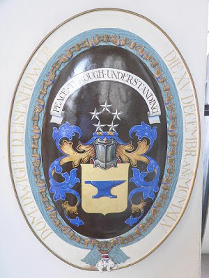
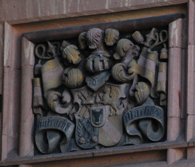
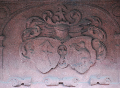
It's taken me a very long time, but I've finally gotten around to framing and hanging the large (20" x 20", or about 51 cm x 51 cm) Flemish heraldic tile that I blogged about on December 13, 2010 (http://blog.appletonstudios.com/2010/12/another-heraldic-mystery.html) (yeah, it's been over two years since I bought it, so it is well overdue).  I have to admit that I have made no progress yet in determining the reference on the plaque to the years 1924 and 1949, but given how long it's taken me to get it framed, and how much stuff I've been doing in the meantime (much of which you have seen in my various posts on this blog between then and now), it's not all that surprising.  Oh, well, someday I'm going to retire and have full days that I can devote to heraldic research.

Anyway, I mentioned that this plaque was going to replace a large very naturalistic depiction of the arms of Mexico, superimposed over a relief map of the country and the whole thing bordered with the arms and names of its constituent states, and now it has.  I'm still trying to figure out where I'm going to move Mexico to; as I said in that earlier post, "So much heraldry; so few walls."  But I really like it, and am not willing to consign it to the dust bin!

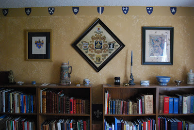
So here are the "before" (with Mexico) and "after" (with the Flemish plaque) pictures of the bookcase wall of my home office.  (The apparent curvature of the ceiling is an artifact of using a wider-angle lens on the camera.  It's really straight.  No, trust me, it is!)  For those of you who are interested, clicking on either picture should open a larger, higher resolution version.


Nice!  I really love being able to work in this room!


French Heraldry in the Blogosphere

$
0
0
In a recent (January 25, 2013) post over on The French Genealogy Blog, blogger Anne Morddel writes about The Cabinet des Titres, the Cabinet of Titles, a part of the French manuscripts collection at the Bibliothèque nationale de France, the French National Library.  Included in the Cabinet are such things as d'Hozier's Armorial général de France and such other manuscripts and books as the Armorial général des registres de la noblesse de France, and a whole bunch of other stuff of use both to genealogists and to heraldry enthusiasts.  The post has several links to some parts of the collection, and other parts (the Armorial général de France, for example) can be found by doing a simple search on the website of the National Library.

It's a short but very informative article, giving some background that I hadn't seen before on the d'Hozier's and the Armorial général, as well as introducing me to some new-to-me volumes available at the National Library's website.  If you have an interest in French heraldry, I suggest you go read the article and follow the links to see what's available.  (And, of course, if you have an interest in French genealogy, the entire blog is a great resource.)  The Cabinet des Titres post can be found on-line at http://french-genealogy.typepad.com/genealogie/2013/01/the-cabinet-des-titres-.html

Bonne chance!

American Heraldry in a Danish Heraldic Exhibition

$
0
0
Or, at least, an American President's heraldry.

At last fall's International Congress of Genealogical and Heraldic Sciences, Danish heraldic artist Ronny Andersen kindly gave me a copy of the catalog (which he also helped to put together) for an exhibit of heraldry in Denmark, "Knights: in the book and on the shield."  (Well, the title really is "Riddere: i bog og på skjold," but that's what it translates to in English.)  The description of the exhibit on the front cover notes:


Exhibition of models of coats of arms from the orders' chapter archive
Her Majesty the Queen's Small Library, Christian VIII's Palace at Amalienborg
May 25, 2012 - January 1, 2014

(Well, that's how Bing translates it, with an assist from me, who knows that in this context, "wappen" is "coats of arms" and not "weapons," for example.)

So if any of you should have the opportunity to go to Amalienborg this year, be sure to try to attend this exhibit, which includes arms from members of both the Order of the Elephant and the Order of the Dannebrog.  Just from the catalog it looks to be well worth the time.  But I digress.

On page 14 of the catalog is a portion of an article (in English) about the arms of President Dwight D. Eisenhower and the meaning of the (many!) symbols upon it.


For those of you who are interested, there is some additional background on this, an earlier attempt, and the final coat of arms for Ike following his induction into the Order of the Elephant following WWII, on the website of the American Heraldry Society at Dwight David Eisenhower, 34th President of the United States

As you can read there, the above proposal for his arms was not accepted for a couple of politely-stated reasons, but basically because it was just too bloody complex.  Eventually this much simpler, far more identifiable design was proposed and accepted.  (And aren't we all glad for that?)


In another post on this blog nearly three years ago I noted a semi-heraldic doodle made by Eisenhower during his Presidency (created during what must not have been a very exciting meeting).  That post can be found at http://blog.appletonstudios.com/2009/02/homemade-american-heraldry-or-hah-i.html

The Arms of Heidelberg

$
0
0
So, to get back on track from our trip last fall, as I mentioned we took a few days and spent them in Heidelberg, Germany. We were there mostly to visit places (streets, possible houses, and churches) related to some of my ancestors who lived there in the 1700s and 1800s.  (My great-grandfather emigrated from Heidelberg in 1881 at the ripe old age of 14.  He was, alas, the last of his surname living there, having no siblings, and his parents and grandparents having pre-deceased him.)

Naturally enough, especially in what is effectively a tourist destination like Heidelberg, which has been attracting visitors for a long time now, we ran across a number of depictions of the city's coat of arms, Sable, a lion rampant Or armed, langued, and crowned Gules, atop a trimount Vert (some depictions show the lion double-queued, or double-tailed, and some show it queue-forchy, or split-tailed, while the majority give it a single tail), done in various media and in several artistic styles, from pretty classical to very modern.

It's a great coat of arms in that it is simple, easy to identify, and can be done in a wide variety of ways.


 This one, with the arms of Heideldberg on the right, is from a memorial inside the Peterskirche.


The one above is from a roof boss in the Heiliggeistkirche; the one below from one of its interior pillars.


A stained glass window in the Zum Ritter Hotel.


On the exterior of the University Library.


On a shield being held by the statue of Hercules in the Marktplatz.


The city's coat of arms "in the round" as it were (with the additions of a sword and orb, which makes for an awkward "rampant" pose).


This one has the black of the shield gilded, while the golden lion is done in a terracotta color.


In a modern style on a banner ("of the livery" colors, black and gold) in the Market Square, suspended from a pole with the lion from the arms (in a matching style) as the finial atop the pole (below).


And last, but certainly not least, again in a modern style on the door handles to the building housing the tourist bureau.  (Where a couple of very nice young ladies did their best to help me read photocopied excerpts from some 1860s city directories and try to find where some of the streets listed in them are located.)

It was great for me as an heraldry enthusiast to keep running into the city's coat of arms all over the old city done in so many different media and styles.  I just love it when a place really uses its heraldry, and Heidelberg certainly does that.  (If only I'd been able to locate a tshirt in my size with the arms on it.  But I did find, and buy, not one but two different baseball caps with the arms, so I'm really not complaining at all!  One of them is my new favorite cap, moving the previous favorite, one I bought in Quebec City with the crowned badge of the Royal 22e Régiment, to second favorite.)


A "Pair" of Arms in Heidelberg

$
0
0
Wandering about the streets of Heidelberg with a digital camera that looked like it had been implanted in or glued to my face ...

Jo Ann claims this is how she saw me
for much of our time in Europe

,,, because there's just so very much heraldry to photograph, don' t you know, I came across two different but similar coats of arms in the city.


Aren't these interesting?  On different buildings, and they are different coats of arms, but the initial impression of them is that they are very similar.  And, indeed, the third quarter of each coat (in the lower left as you look at it) are the same, and the fourth quarters (in the lower right) both have a field and a bend, though if the first coat is hatched properly, the colors of the shield and bend are different.  The second quarter (in the upper right) appear at first glance to be the same, but in the upper coat, that quarter is the arms of the City of Heidelberg with the crowned lion atop a rock, while in the lower coat, the charge is a griffin.  The first quarter of each coat (that in the upper left) is quite different in each case, the upper being a sword surmounted by a hanging balance and the lower being four arrows inverted in saltire.  And, of course, the inescutcheons (the smaller shields overall) are completely different, as well, the upper one being a cypher (TR or possibly FR) and the lower one being a crowned bull's head cabossed, possibly within a bordure.

Still, in looking through all my photos taken in Heidelberg, these two stood out to me as looking very similar, while being quite different.

Coats of Arms at Heidelberg University

$
0
0
Continuing our heraldic tour of Heidelberg, Germany, we must naturally enough go by the University.  The city has been a university town for literally centuries.  Founded in 1386, the university is the oldest in Germany, and was the third university established in the Holy Roman Empire.  Naturally enough, it has a coat of arms, which it proudly displays in a variety of ways: in color and hatched, and sometimes (as in this example and another, below) both.


The blazon of the arms in English is: Or a bend gules.  Which is about as simple a coat of arms as you can possibly get.


There are also, on different buildings, heraldry-like, but blank, shields.  (To my mind, these are crying out for some sort of real heraldry to be placed on them!  However, lacking a long ladder, carving tools and/or spray paint, and the courage to no doubt break a number of German laws, I was not about to attempt to rectify that situation myself.)


Still, don't you wish that someone would create some heraldry on those blank shields?

More Heraldry in Heidelberg

$
0
0
One of the big tourist destinations in Heidelberg is the Hotel Zum Ritter, which in addition to being a fine old building, has various displays of heraldry about it.


As their name suggests (Hotel at the Knight), their emblem is the knight St. George slaying the dragon, as displayed on the sign outside.  Which sign, as you can see, also has a depiction of the arms of the City of Heidelberg in the corner.


The red sandstone facade of the building has a number of carvings and bas reliefs of various subjects on it, but of course, I was drawn to the panel with the two coats of arms, above: a ram salient and two fishes haurient.

We managed to go by the Hotel about mid-morning when they were starting to set up for lunch, and asked and received permission to go inside the restaurant portion to photograph some of the stained glass panels that we could see from the street.  In addition to one panel containing the arms of Heidelberg which you will find in the post from February 14 (http://blog.appletonstudios.com/2013/02/the-arms-of-heidelberg.html), they also had these two panels of the following:


This one of the quartered arms of Pfalz and Bayern (in English, Bavaria).


And this one of family arms, but whose name was half-covered by the curtain which I wasn't going to push my luck by moving.  We seemed to be making the staff a little nervous already by our presence.  So, sorry, I don't know (yet) whose arms this panel displays.

But what a great display of heraldry to run across that day!

Ecclesiastical Heraldry in the Blogosphere

$
0
0
There's a short but informative post today over on the blog Seasons of Grace by blogger Kathy Schiffer on what will be the arms of the Vatican when Pope Benedict XVI steps down later this week.  It's an interesting post about what is probably a lesser-known aspect of the Papal interregnum that occurs between the death or resignation of one Pope and the election of another.

She also looks at Benedict XVI's coat of arms and the meaning for him on the charges on it.

If you'd like to see what she says about the Vatican and the heraldry of this upcoming interregnum, her post can be found on-line at http://www.patheos.com/blogs/kathyschiffer/2013/02/a-coat-of-arms-for-the-interregnum/

Faux Heraldry in Heidelberg

$
0
0
There were, of course, some displays of "heraldry" in Heidelberg which were not coats of arms at all, but merely aped real heraldry.  I present to you the following examples:


The example above from a street sign for a brew house.  Shield, helm, mantling, torse, and crest.  But the shield is simply a landscape of the old bridge and the castle at Heidelberg, as seen from across the river, and thus isn't really "heraldry" at all, despite the accouterments.


This shield was seen in a window around the corner from where my great-great-great grandfather used to live.  Presumable it's a child's toy shield; frankly, I was more interested in the steins below it.  Was that bad of me?


A beautiful display of ... a blank shield, with helm, crest of ostrich feathers, mantling, and imitation collar surrounding the shield.  Ah, if only they'd carved some one's arms on the shield!


And finally, a cypher masquerading as a coat of arms.  (But what beautiful carving!  Very impressive.)

The Golden Pike, Heidelberg

$
0
0
So, continuing our wandering about the Altstadt, the Old City of Heidelberg, we ran across a hotel near the Old Bridge with a coat of arms and by the name Goldener Hecht.


It's a beautifully done carving, and the painting is also very well done.

Still, I thought, what does this have to do with a "golden pike," the translation of the name?  The arms, Gules three escutcheons Or, just didn't seem to match the name, so it's certainly not canting arms!  (For any non-heralds who may be reading this, in heraldry a "pike" generally refers to the fish and not to the polearm.  But as you can easily see, there are neither fish nor polearms on the arms.)

Well, just around the corner we found this.


It's not golden by any stretch of the imagination, and the paint here is much more weathered than the arms over the front door, but it helps to explain the name.

What a beautiful display of heraldry, even if it did confuse me a little at first.

Memorial Heraldry in Heidelberg

$
0
0
We spent a lot of our time in Heidelberg in and around two churches: the Heiliggeistekirche (the Holy Spirit Church) and Der Peterskirche (Peter's Church).  Before getting to the heraldry we saw there, I thought I'd explain why we went to those two churches in particular.

My great-great grandparents both attended the Holy Spirit Church.  However, at that time, there was a wall filling the church separating into two parts.  The Catholics (of whom my great-great grandfather was one, as were his parents and their parents) and the Protestants (of whom my great-great grandmother was one, as were her parents and their parents) each met in one of the two parts of the divided building.  But somehow, these two met and married, but did not do so in the Holy Spirit Church.  Rather, my great-great grandfather converted to Protestantism, and in May of 1865 married my great-great grandmother in the Protestant Peter's Church, which was the church which still serves Heidelberg University.  A little later, on April 23, 1867, my great-grandfather was born and was baptized at Peter's Church.  As a consequence, both of these churches have family connections to me, and I was able to spend a fair bit of time in and around both of them. Fortunately for you, they also each had a fair bit of heraldry in them.

The following are a couple of the heraldic monuments mounted on the exterior of Peterskirche.


The monument above is to four people, a father and son with their respective wives.  From left to right we have (assuming I am reading the Latin and German correctly):

Michel Miler der Alt, 1555
Margreta Bobe, 1586

Michel Miler der Jung, 1587
Agnes Mullerin, 1605

The elder Michel Miler's arms have a cog wheel on them; the younger Michel Miler's arms have a cog wheel and in chief what looks like a gridiron.  (It is also possibly a harrow, but I am less confident of that possibility.)

Magreta Bobe's arms have the trunk or branch of an oak tree fesswise (horizontally) and sprouting leaves, while Agnes Mullerin's arms have an equal-armed cross in chief (of which part of the uppermost arm is missing).


Some of the monuments have been better protected from the elements than others, as you can see from this very worn one here.  Indeed, of the inscription below the shield only a few letters on the upper left-hand part remain, and it is impossible to make out what the figures on the shield are anymore, but the crest of a griffin's head is quite distinctive!

Ecclesiastical Heraldry in the News!

$
0
0

No, I don’t (yet) mean the arms of the new Pope.  The new Bishop of Las Cruces, New Mexico, the Most Reverend Oscar Cantu, has his coat of arms emblazoned, blazoned, and discussed in an article on the website of television stations KVIA, which serves both El Paso, Texas and Las Cruces, New Mexico.


I’m glad that the article gives a blazon for the arms, as otherwise I would have mistaken the charges on the fess (the horizontal white stripe) for some kind of robot.  (Which lets you know how much science fiction I watch!)  Still, I found the blazon to be a bit confusing.  “Upon a field party per fess Azure and Vert two crosiers in saltair [sic], the one per bend a bishop's crosier Or and the one per bend sinister, a veiled abbot's crosier Argent; upon a table Sable a host and chalice Proper all upon a fess overall of the fourth.

It’s been my experience that one blazons the charges on the field first, and only then the charges which lie on other charges.  In other words, “Per fess Azure and Vert two crosiers in saltire, the one bendwise a bishop's crosier Or and the one bendwise sinister a veiled abbot's crosier, overall on a fess Argent on a table Sable a host and chalice Proper.”

Further, I would note that not even the College of Arms in London is any longer blazoning tinctures with “of the first,” “of the second,” etc. as being confusing.  Witness the blazon in the second paragraph quoted from the article, where you have to hunt through three-quarters of the blazon to figure out which tincture is the “fourth” one cited.  It’s easier simply to repeat the tincture if necessary.  Which isn’t necessary anyway in my proposed blazon.

As a final quibble, the croziers are not “per bend” and “per bend sinister.”  The gold one is “bendwise,” “lying in the direction of the bend” according to J.P. Brooke-Little’s An Heraldic Alphabet, and by extension the white crozier is lying in the direction of a bend sinister.  “Per bend” is how it would be divided if it were of two different tinctures with the line of demarcation running down its length.  This is not the case, and even if it were, it would be a crozier “bendwise per bend A and B,” with A and B being different tinctures.

But what do I know?

The full article can be found on-line at http://www.kvia.com/news/Coat-of-Arms-of-new-Las-Cruces-bishop-and-its-meaning/-/391068/19111956/-/xh955b/-/index.html

Ecclesiastical Heraldry in the News!

$
0
0

Okay, this time it’s about the Pope’s arms.

In an article in the National Post, Father Raymond J. de Souza notes the removal on Wednesday, March 6, 2013, of recently-retired Pope Benedict XVI’s arms from the garden in front of the Vatican Governor's Palace, leaving the crossed keys and tiara above the now dirt-colored, empty shield shape awaiting the election of a new Pope.  With a new Pope in place, the gardeners will place his arms in the currently empty shield.


The garden with Pope Benedict XVI's arms.


The current armorial display.

The article can be found on-line at http://fullcomment.nationalpost.com/2013/03/08/father-raymond-j-de-souza-wary-cardinals-elect-to-move-cautiously/

Heraldry in the News!

$
0
0

In several news articles from mid-February of this year, Deal Town Council and Deal Town FC, in Kent, England have learned the emblem they use is invalid because it is the old coat of arms of the Borough of Deal, which no longer exists. The council said all letterheads and road signs will have to be changed, costing thousands of pounds.  Deal mayor Marlene Burnham considers it "heraldry gone mad". (I'm guessing she considers it so because she doesn't understand how heraldry is supposed to work.)


Deal Borough Council disbanded in 1974 and Deal Town Council was formed in 1996. According to the College of Arms, because the present town does not have the same area as the former Borough, a simple transfer of the arms is not possible.

Deal Town FC, which also uses the coat of arms, has been told the emblem on their shirts will have to go.  Club chairman Dayle Melody said: "Immediately we could just put a patch over the face of it and be badge-less, but that's not something we want to do. ... "It all depends how far the authorities want to go with regards to making us take it off. We've got five kits so that's £4,500 that we'd have to find to replace the kits."

You can see the story at BBC News at http://www.bbc.co.uk/news/uk-england-kent-21475707

A related article at KentOnline, noting the use of the arms by the Deal Victoria and Barns Close Cricket Club stitched into ties, blazers and on a large flag, is also entering the fight to keep using the Deal Borough coat of arms.


Fred Wilson, secretary of Deal Vics, said the club has known for years but continued using the logo without any enforcement from the college.  (This is, of course, because the College of Arms doesn’t really have any enforcement authority.  If they were located in Scotland, it would be an entirely different matter!)

"In 1994 we decided we were going to have it," he said. "We got a letter from the charter trustees saying you can use the emblem of Deal as your coat of arms. Just after that they found out that it hadn't been registered with the college who register them." He added: "People should be pleased to see that so many organisations are proud to have the coat of arms of Deal."  ( Yeah, because every place of business in Deal should be able to use the Deal coat of arms; that wouldn't create any confusion of identity at all! )

That article can be found at http://www.kentonline.co.uk/east_kent_mercury/news/2013/February/21/cricket_club_enters_crest_row.aspx

In a follow-up article in This Is Kent on February 27, the Deal Town Council has voted unanimously to opt for the cheaper (than the £10,000 they said it would have cost to change the arms) option of taking on the Cinque Ports arms, personalised with the town name and motto.

The trouble, of course, is that the image that they link to in the article is not the arms of the Cinque Ports, but the arms of Hastings, which is only one member of the Cinque Ports Confederation of Hastings, New Romney, Hythe, Dover, and Sandwich.  This is the Hastings arms.


I am assuming that what they are actually doing is dropping the charged chief from the old arms of the Borough and adding the town name above and motto below the shield, and not taking the arms of Hastings (which are differenced from the Cinque Ports by having a whole lion passant guardant in place of the center lion/hulk dimidiation).  In other words, going back to what the Deal coat of arms was a little over a century ago, as you can see in this postcard from the very early 1900s.


This article can be found on-line at http://www.thisiskent.co.uk/Deal-Town-Council-choose-Cinque-Ports-coat-arms/story-18266892-detail/story.html#axzz2N5UuDax0

More Memorial Heraldry at Peterskirche in Heidelberg

$
0
0
Continuing with some more of the heraldic memorials found on the exterior of Peterskirche in Heidelberg, we have:


These arms, of a stork with a snake in its beak, are found on the monument to Joanni Pinciero Henricie Rauschen, died in his adolescence (moribus adolsescenti) in Heidelberg (well, Heidelbergæ) on January 8, 1593.


 This monument is to Johann Simeon Torger, 1598, and Susanna (well, I can't quite make out the surname; it looks like Bieghift, but that doesn't sound quite right to me), 1606.

His arms are Per fess, a rose and a fleur-de-lis.  Her arms look to me to contain something that in English would be blazoned as a hulk, a mastless ship, which is blazoned in German a mastlose Kogge or a Kahn.  (According to my copy of Das Grosse Buch der Wappenkunst.)  It is possible that it might be an upside-down horseshoe, but a close inspection of the charge enlarged leads me to believe it is not.

It's a beautifully carved achievement, especially the way the mantling swirls and curls on either side of the helmet.


And here are the arms on the monument of Matthes Mais.  I could not find a date on the inscription.  The arms, however, are very simple: a field and a bird, possibly a dove.  The crest, following the usual German fashion, is a bird as on the arms.  (Carved in much deeper relief, the crest has lost its head.)


And Now for Something Completely Different

$
0
0

If you'll pardon my stealing that line from Monty Python's Flying Circus for my title.

I am going to be presenting my very first webinar this coming Thursday evening, March 21, at 9:00 p.m. Eastern Daylight Time (8 Central, 7 Mountain, 6 Pacific), being hosted by Rootsonomy.

Entitled "Finding Your New England Ancestors," this presentation obviously has very little to do with heraldry (sorry to disappoint all my heraldry enthusiast friends!). However, if you are interested in an overview of doing genealogical research in the six states of New England, you can register at https://attendee.gotowebinar.com/register/8252593778405447424


Yes, there is a small (US$5) fee for participating in the webinar, payable to Rootsonomy via PayPal to Rootsonomy@gmail.com or by going to http://goo.gl/gBDoF.

If this is a success, who knows? They might ask me back to do some more!  (Maybe even something to do with heraldry.)

Some Unusual Memorial Heraldry at Peterskirche

$
0
0
I'd love to know more about the following memorial.  The inscription is hard to make out; in the topmost (and best preserved) of three panels of inscriptions, about 1/3 of the words are completely worn away, and the lower panels are progressively worse.  It would be hard to read even in my native language without the missing words, and the inscriptions here are in German in a German script.  Still, the arms are in fairly good condition, and I found them fascinating.


The left-hand shield (and the crest) consist of a rune-like symbol called a housemark (in German, hausmark, plural hausmarken).  As their name implies, these symbols were originally used to mark houses, before being moved onto shields as heraldry.

It's the other shield, the one on the right, that really intrigues me.  It looks like a bear (the face is too long to be a monkey, and it lacks the usual collar around that waist that helps to identify heraldic monkeys) sitting on a rock either drinking from a flask or playing panpipes, I'm not sure which.  (One of the first things it reminded me of was Winnie the Pooh about to get his head stuck in his honey pot!)  This is one of those coats of arms where you just know there's got to be a good story to it!

I didn't see this coat in a quick search of the Dictionnaire de Renesse, his ordinary of all of the arms in Rietstap's Armorial Général, but it's certainly possible that I missed something.  (Reading French, with many French abbreviations, is not my forte at all!)  And, of course, it's possible that these arms do not appear in Rietstap, and therefore not in Renesse.  As Pooh might say, "Oh, bother!"

Heraldry in the News!

$
0
0
In a post last week (March 13, 2013), I noted several news articles about the town of Deal in Kent, England, which had been told that the coat of arms they were using was not legitimately theirs to use, as it had been the arms of the (now defunct) Borough of Deal.

The town council has followed through on the plans noted then, and has adopted the arms of the Cinque Ports Confederation, differenced with the town motto, as their new coat of arms.

As you can see by the illustration of the "new" arms above, they did not - for which all of us, and not just Hastings, should be glad - adopt the arms of Hastings, which illustrated one of the earlier news articles that I pointed out in my March 13 post.  (Be that as it may, I'm not entirely happy with the illustration above; all of the renditions of the Cinque Port arms that I have ever seen - until now - did not have the black horizontal lines separating the three lions and three hulks.  I have no idea why the artist who drew this thought that they needed to be there.  Indeed, not even the vertical black line is necessary to the arms, but it at least has a little more reason to be there than the horizontal lines do, since it does divide the shield per pale.)

The full article about this adoption of these "new" arms can be found on-line at the BBC: http://www.bbc.co.uk/news/uk-england-kent-21862909

A Request for Assistance

$
0
0
A reader of this blog has sent me a photograph of a coat of arms on an enameled blown glass jar made in Venice circa 1500.  He hoped that I would be able to help him identify the heraldry on the jar.  After searching through all my general armorials and ordinaries (e.g., Rietstap's Armorial Général, Papworth's Ordinary of British Armorials, and the Dictionnaire de Renesse, as well a thumbing through some of my reproduction armorials (the hard way, page by page), I've come up blank.  (I've often said that, when you go trying to trace a particular coat of arms, you just never know what you're going to find.  Sometimes it's a whole lot; sometimes it's nothing.  You just never know when you start out how it's going to end.)

While the jar was made in Venice, it is entirely possible that the arms on it are not Italian, but that it was made for export.  Indeed, the jar was acquired in England.  Hence the broad search through the general armorials and ordinaries.

I told him that I'd been unable to find the coat and asked him if I could post his photograph of them on-line and ask for assistance from the heraldic community, and he gave his permission to do so.  So, in the manner of posting the faces of missing children on milk cartons here in the States ...

Have you seen this coat of arms?


I am assuming that the border around the shield is simply decoration and not a part of the coat of arms. I also searched for it both as Per fess Azure and Argent ... and Argent, on a chief Azure ..., since it could be interpreted either way.  I did find a number of arms in Rietstap that were Per fess azure and argent, in chief an X Or/Argent, where "X" was a crescent, or a label, or mullets, or a leopard/lion passant guardant, or some other charge, but not a cross Argent, plain, formy, or otherwise.

If you recognize this coat of arms, please feel free to post what you know about it (and in what source you found it, please!) in the comments section below.

Thank you all so much!  I know that if we get enough eyes on this, someone will be able to tell us to whom it belongs.

Heraldry in the News!

$
0
0

O. M. G.

In a March 14, 2013 article at Volume One, entitled "A Coat of Arms for Eau Claire?," Eau Claire, Wisconsin, City Councilman David Duax has been spearheading an effort to get the city to adopt a coat of arms.  Councilman Duax and Council President Kerry Kincaid have worked with Eau Claire graphic artist Rachel Schimelman to create a "coat of arms," which would also be used as part of the city's official seal. A draft version of the artwork, unveiled by Kincaid at Eau Claire's Own Birthday Bash at the Volume One Gallery on March 9, is shown below.


As I said, O. M. G.

Apparently they opted to go with what I tend to term "kitchen sink" heraldry, containing as it does "everything but the kitchen sink."  The Volume One article suggested that to include all of the symbols of Eau Claire, you would choose: "The mighty Chippewa River and its more slender sibling, the Eau Claire River.... Trees to represent lumbering. Something to honor the region's indigenous inhabitants, ... and something French too. And don't forget our most famous avian historical figure, Old Abe the war eagle."  Not to mention "the tower of the original county courthouse," a star to symbolize Eau Claire's status as a county seat, and "fleurs-de-lis represent the entities (two villages and four townships) that were united to create the city in 1872."  And, of course, we mustn't overlook the inescutcheon and the "outescutcheon" (for lack of a better term), nor the two trees as supporters.  As I said, "kitchen sink" heraldry.

Ms. Schimelman "had never been asked to create a coat of arms before," something I have no trouble at all believing.  And she doesn't expect the City Council to seek many changes. "'I don't think council members see themselves as on-the-fly graphic artists,' she said with a laugh."  And if they actually don't ask for many changes, I can easily believe that, too.

I suppose I shouldn't complain too much; it does obey the rule of contrast (no color upon color, and no metal upon metal), after all, something that many heraldic designs by non-heralds fail to do.

But I think they could have done so much better.

The full article can be found on-line at http://volumeone.org/articles/2013/03/12/5200_a_coat_of_arms_for_eau_claire

Viewing all 1369 articles
Browse latest View live